The icon of the future: designing the universal symbol for reuse.
Keywords:
Branding, Philosophy, Rebranding, Visual identity design, Universal symbol, Circular economies, PR3 Standards, RESOLVE.ong, Sustainable design.
- Strategic Branding
- Identity Guides
- Brand philosophy


Featured in Fast Company
Meet the new ‘reuse’ symbol, a spiraling cousin to the ‘recycling’ icon
A global alliance of businesses, governments, and designers just unveiled a universal mark for reuse—and it could reshape how the world handles waste.
Featured in PR3
The World Has a New Symbol for Reuse
Global alliance of businesses, governments, designers, and NGOs unveils universal symbol designed to help scale the reuse economy worldwide.
Starting point
- The current global model of production and consumption follows an unsustainable linear logic of "take, make, waste," where nearly half of the world's plastic waste stems from single-use packaging—with a mere 9% of global plastic successfully recycled.
- International organization RESOLVE.ong —through its global standards panel PR3—launched the historic Rebrand Reuse initiative: a global design competition conceived to create the first universal reuse symbol (the icon of the future) to definitively differentiate returnable packaging from disposable or recyclable materials.
- Faced with a unique opportunity in the history of environmental-impact design, we at Epigrama Studios took on the challenge of participating in this international competition against creatives from all over the world. The objective was not to design a traditional corporate logo for a private brand, but rather to co-create a global public good: a standardized visual language capable of integrating into international regulatory frameworks for returnable packaging (e.g., coffee cups, containers, bottles).
- Following a rigorous evaluation process by a jury composed of global sustainability and design leaders, Epigrama was selected as the winning team to bring this historic symbol to life.
Challenge / Opportunity
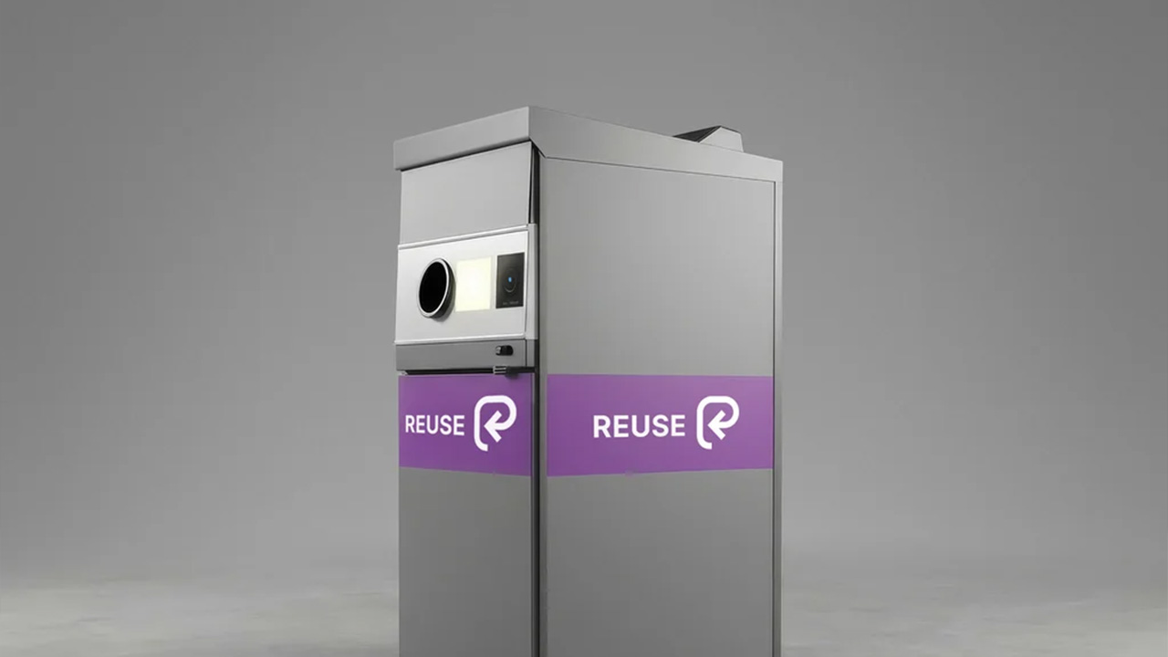
- How do you design an icon with the strength, simplicity, and universal readability necessary to become the new world standard for reuse, competing with or evolving alongside the traditional, iconic recycling logo? The symbol had to be perfectly scalable and adaptable, whether debossed onto a silicone coffee cup, printed on industrial logistics boxes, labeled on large public return bins, or deployed across mobile app interfaces within the circular economy.
- The icon needed to inspire a shift in behavior, ensuring that returning a container is not perceived as a tedious chore or a regulatory burden, but rather as a conscious, creative act filled with meaning and care for the planet.
What We Did
We developed the winning graphic proposal based on the idea of looking back to remember practices we already inhabit but have disconnected from. Consequently, we understood this symbol as a tribute to worldviews that challenge the linear logics of consumerism culture:
- Narrative Philosophy of the Return: We structured the symbol's conceptual manifesto under the premise of restoring balance and returning everyday objects to their original purpose.
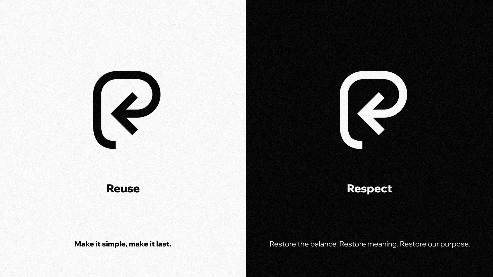
- Universal Symbol Design: We modeled a continuous geometry based on a stroke that returns to itself, symbolizing absolute circularity and subtly evoking a strategic letter "R" (Return, Retornable).
- Information Architecture for Labeling: We designed the icon's behavior alongside other waste visual systems to ensure immediate technical readability on commercial packaging.
- Design for Second Chances: We built a powerful brand discourse focused on proving that although modern models have failed, objects and societies are ready to remember and re-enter continuous, waste-free cycles of use.
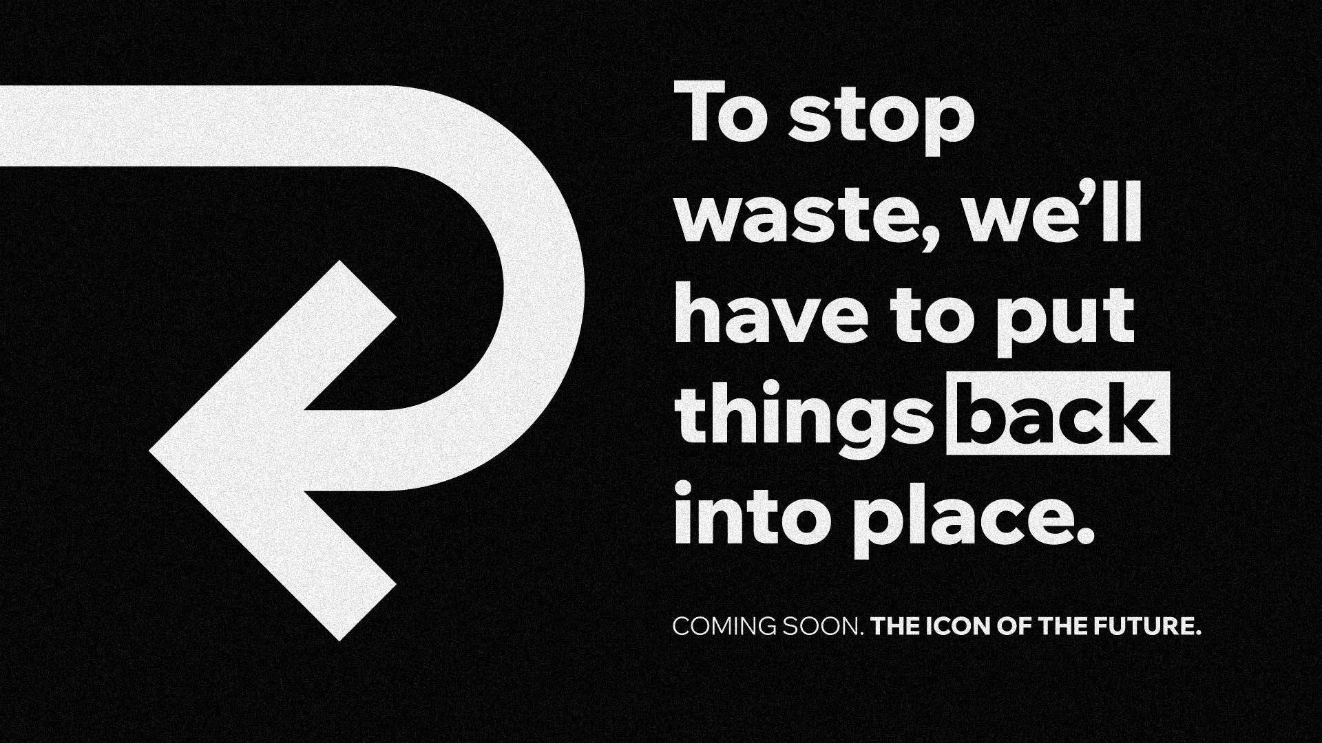
1. Narrative Philosophy of the Return: "Make it simple, make it last"
Alongside Epigrama's creative team, we conceived the proposal under a profound premise: reuse is not a detached technological challenge, but a problem of human reconnection with our roots, nature, and collective values. Under the manifesto of "Make it simple, make it last," we understood that to halt massive waste, we had to design a concept that visually ordered the environment, returning objects to their original place.
We structured a brand narrative where daily-use packaging (cups, bottles, boxes) speaks directly to the user, demanding to be put back into operation instead of being abandoned in the trash. In this way, the campaign's narrative transformed the act of reusing into a profound process of restoration, realignment, respect, and reciprocity with our common home.
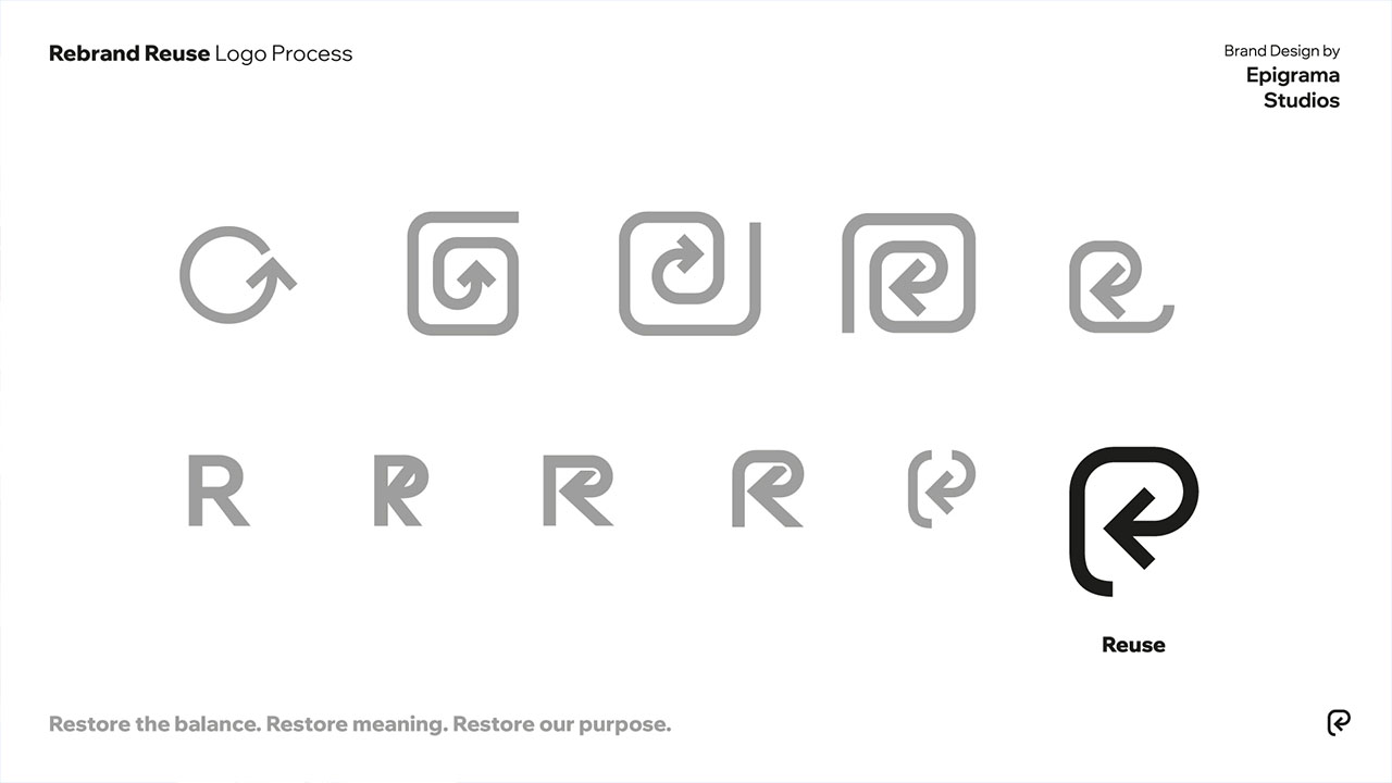
2. The Evolution of the 'R': Anatomy of a Logo that Returns to Itself
o materialize this philosophy into a world-scale icon, we designed a pure geometry based on absolute continuity. The conceptual core of the graphic proposal was to give life to a logo that, literally and metaphorically, constantly returns to itself. This fluid, closed trajectory symbolizes perfect circularity, the renewal of matter, and the constancy of sustainable cycles, representing the idea that within a true closed-loop system, nothing is lost—everything is transformed and reintegrated into its origin.
During the technical refinement process, we faced the mandatory question: should the design look like the letter "R"? The answer was a masterstroke of visual appropriation: the stroke subtly and elegantly evokes the structure of an "R" to condense the pillars of the movement (Restore, realign, reciprocity, reuse, repeat, respect). By leveraging the historical and global recognition that consumers already have of the recycling "R," the symbol does not destroy the past; instead, it positions itself intelligently as its natural superior evolution—a visual reminder that we are the new generation of environmental responsibility.
Visit our home page to see more projects in motion.
3. Extreme Scalability and Adaptability in the Commercial Ecosystem
Since the symbol was destined to be officially integrated into the PR3 global labeling manuals (a technical standardization guide for cities across North America, Europe, and Asia), its graphic behavior had to be flawless in terms of design engineering. At Epigrama, we conducted rigorous tests to ensure the icon's maximum legibility and fidelity under any technical circumstance.
We developed an application guide demonstrating how the logo maintains its clarity and recognition in both micro and macro formats. The symbol was optimized to work in a single ink, in negative, stenciled onto coarse materials, or rendered on high-resolution screens, guaranteeing an inclusive, equitable, and friction-free industrial deployment for the project's corporate allies.
4. Design for Second Chances: A Global Manifesto of Permanence
The closing of our creative process with RESOLVE.ong consisted of packaging the design not as a static product, but as a living global movement. The old traditional recycling system has shown severe structural limitations, but as creators, we are convinced that objects and societies are designed to receive second chances.
The icon designed by Epigrama Studios ultimately functions as a visual manifesto of permanence. It directly and elegantly communicates a powerful message to citizens: don't let us go, don't turn us into trash, simply bring us back to the place where we belong to continue the cycle. We succeeded in making a small graphic mark carry the weight of a vision for the future: making reuse the global norm and waste the exception.
Results Achieved
- Official Winners of a Global Design Milestone: Epigrama Studios consolidated its position as the winning studio of the international call championed by RESOLVE.ong's PR3 panel, receiving endorsement and validation from elite international juries and agencies of the caliber of Accenture Song, Droga5, and The One Club for Creativity.
- Integration into International Labeling Standards: The universal symbol designed by our studio officially becomes part of the PR3 Labeling Standard, serving as the official technical and visual blueprint regulated by standardization organizations such as the American National Standards Institute (ANSI) and projected toward ISO certification.
- Official Signage for Global Urban Infrastructures: The icon transforms into the official identity that will guide new interoperable, returnable packaging networks and systems across more than a dozen pilot cities worldwide, positioning Epigrama Studios as an historical benchmark for strategic design with global environmental impact.
Acceptance Speech
Below is the transcript of the award acceptance speech at the ceremony, received by Team Leads Nicole Ascanio and Juan S. Navarrete.
"Good evening to all participants, to the Rebrand Reuse team, PR3, the Resolve project. Grateful to have a space in the conversation that's being woven.
For too long, the consumerism culture has taught us that time is a lineal phenomenon. It makes us overlook history, and pretend there's a prize somewhere forward. A sort of hamster wheel that cages the future. It has run over cultures, pulverized millennial practices, cosmologies, diversity and devoured life but also philosophies of care and cooperation. Other relationships with time and nature.
We come from Colombia, a land of life. A territory of ancient cultures that bent time long ago. We don't feel time as a line, but as a spiral.
And in this spiral-shaped history our job is to restore the memory of our destiny. To bend the line. To go back to ourselves.This is the purpose of our company Epigrama Studios.
Now, the rebrand reuse project is a timely space for us. A great opportunity to honour the spiral. It strengthened our mission, the mission of a generation. We took it as a reminder that the answers for the issues of today might not be forward in time.
Our generation has seen everything. Civil and environmental crises have exposed that consumerism and its modern institutions are a deceptive capital theocracy that encourages greed and kills the village.
But, we are in the nick of time, when the spiral needs to turn. The opportunity to design futures and also to open the western ears to the tales and philosophies blowing from the south.
So reuse, restore, realign, repeat, remind and recognize. We must recognize that the heart of the world beats, our ancestral water factories function, and our global lungs breathe thanks to the ones that have resisted there.
This here is also a symbol of responsibility. It's time to give back to the world, restore balance, recover meaning, remake our purpose as human kind.
The path of the spiral leads inside. Both as persons or collectives. The answer to our future is there.
We already know the destiny of a line in a circular planet. We don't want to be stuck in the production line, we already know the destination is waste. Let's put things back into place, back into function. Let's bend the line, embrace the spiral.
This the time of resistance through care and love.
This is our message from the global south.
Thanks for listening".