Hasta el Cogote: sculptural signature jewelry
Keywords:
Rebranding, Signature Jewelry, Premium Identity, Communication Strategy, Export Market, Craftsmanship, Editorial Design.
- Strategic Rebranding & Visual Identity
- Art Direction & Visual Universe
- Packaging Design (Luxury Packaging)
- Contemporary Narrative Strategy (Storytelling)
- Brand Consulting for Internationalization



Starting point
Hasta El Cogote (HEC) is a sculptural jewelry brand in Colombia, led by a talented team of women entrepreneurs who have built a solid track record over a decade in the market.
The brand stood at a strategic turning point: while their pieces held immense artistic and conceptual value, their graphic identity needed an evolution to truly reflect its premium worth. HEC trusted Epigrama Studios to lead a comprehensive transformation, aiming to redesign its visual universe and structure a communication strategy capable of projecting the brand with power into international markets.
Challenge / Opportunity
The core challenge was to execute a strategic rebranding process that would elevate brand perception toward a premium segment, intertwined with an artistic body of work that rescues the feminine essence, the power of the body, and the organic imperfection of hand-sculpted metal.
To prepare HEC for the opening of new international markets and cement it as a benchmark for artistic jewelry, we had to solve three major design and communication hurdles:
- Visual Balance in Identity: Designing a sophisticated and minimalist graphic system that wouldn’t compete with the jewelry, but rather enhance the sculptural and organic forms of the pieces.
- Narrative Evolution (Storytelling): Transforming traditional commercial communication into a "signature jewelry" strategy. The created messaging needed to educate new global audiences on the concept of craftsmanship (the value of the handmade process, conceptual design, and one-of-a-kind pieces), justifying its high-end positioning.
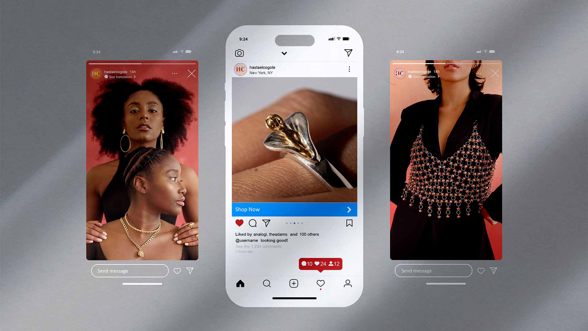
- Omnichannel Consistency for Export: Structuring a flawless brand experience that felt equally exclusive across all touchpoints. The new language had to seamlessly adapt to both the physical world (luxury packaging and tags) and the digital ecosystem (social media and international sales channels).
What We Did
We approached HEC’s transformation from a native and sensitive perspective, understanding that each piece of jewelry is a living story worn on the skin:
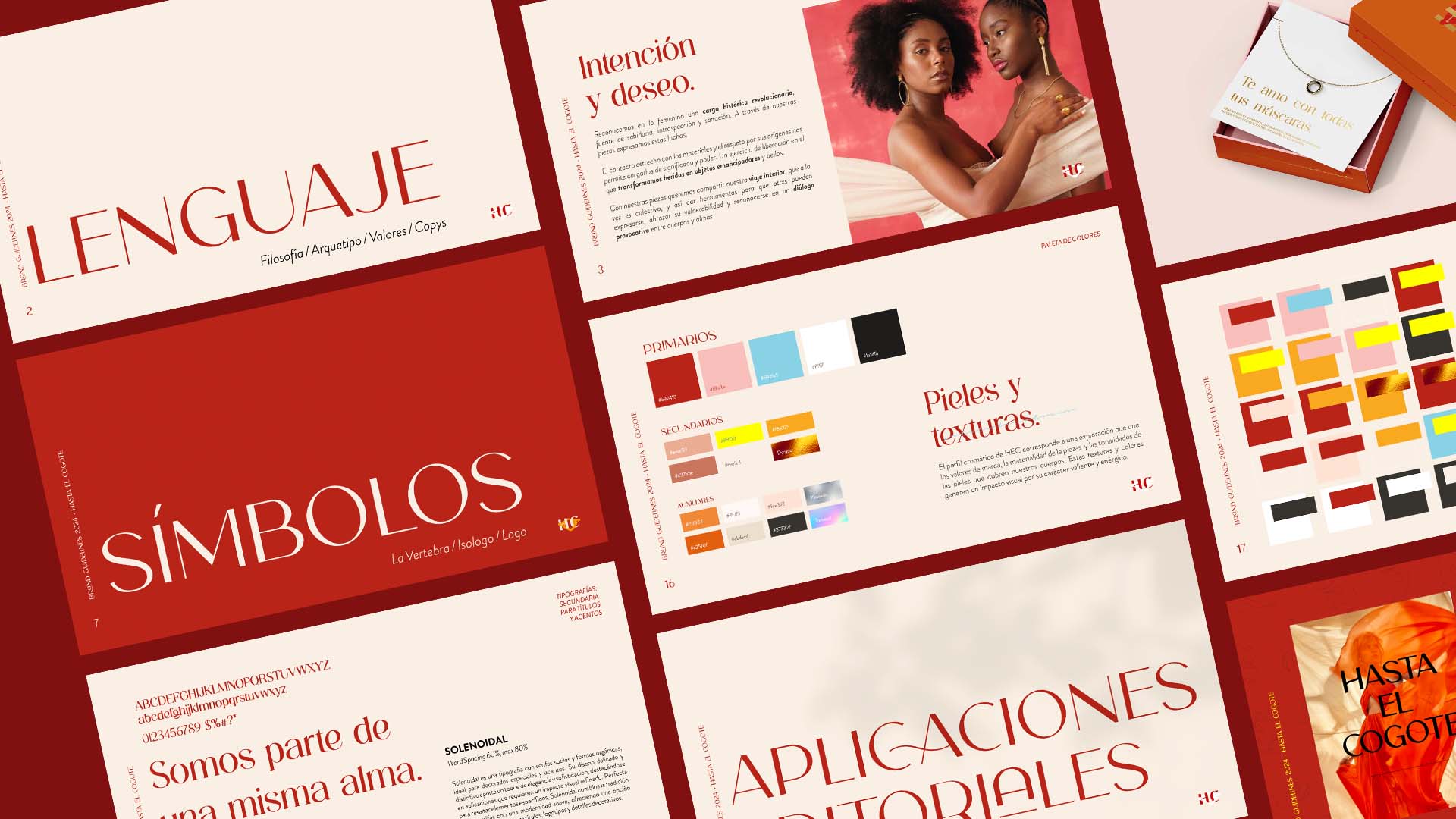
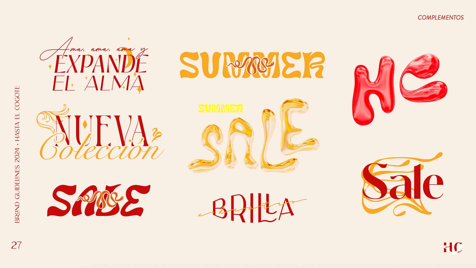
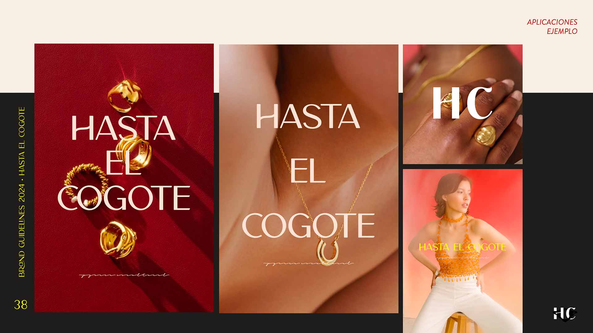
- Visual and Typographic Universe: We created a clean, mature, and high-end identity system. We redesigned the brand mark, seeking a visual harmony that pays homage to the physical weight of metal and the subtlety of the human body’s anatomical lines.
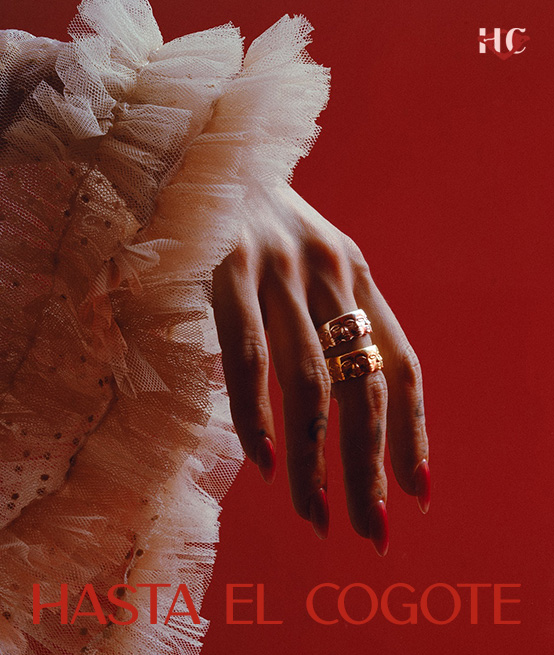
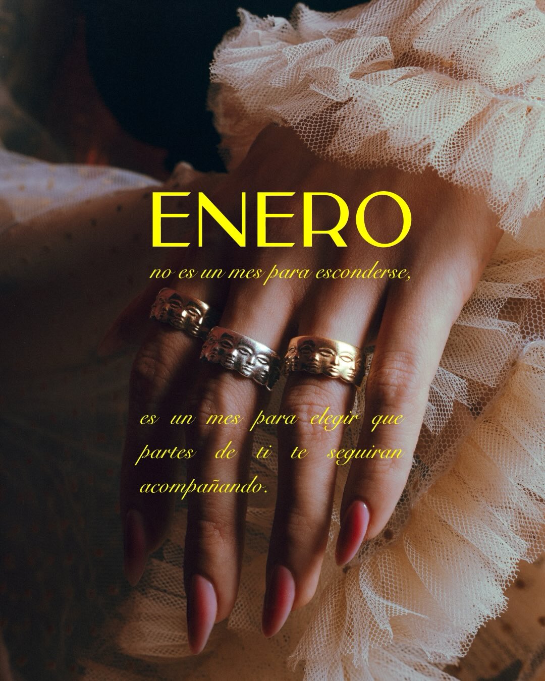
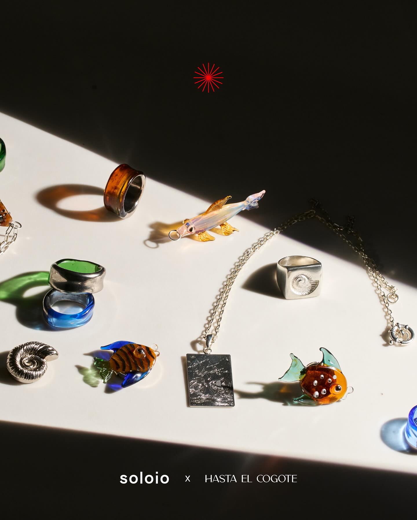
- Photographic Art Direction: We established aesthetic guidelines to capture the pieces under lighting that highlights their textures and artisanal finishes, moving away from cold, traditional jewelry photography and leaning into a museum-like editorial aesthetic.
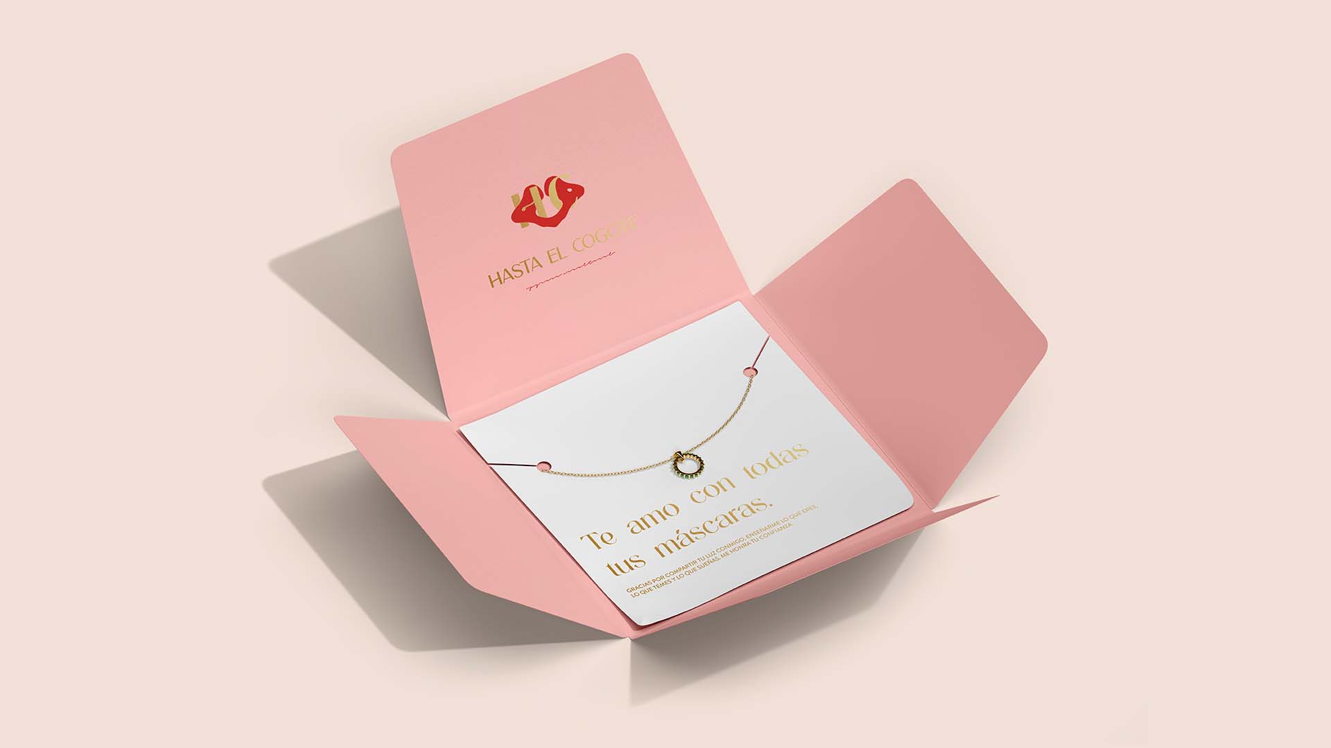
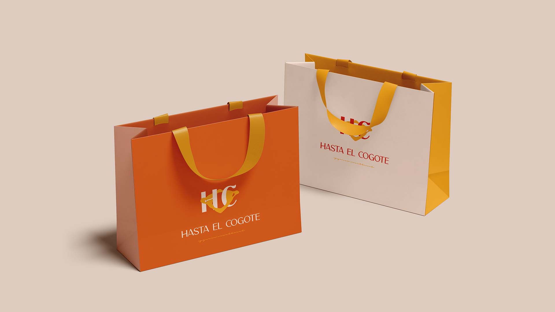
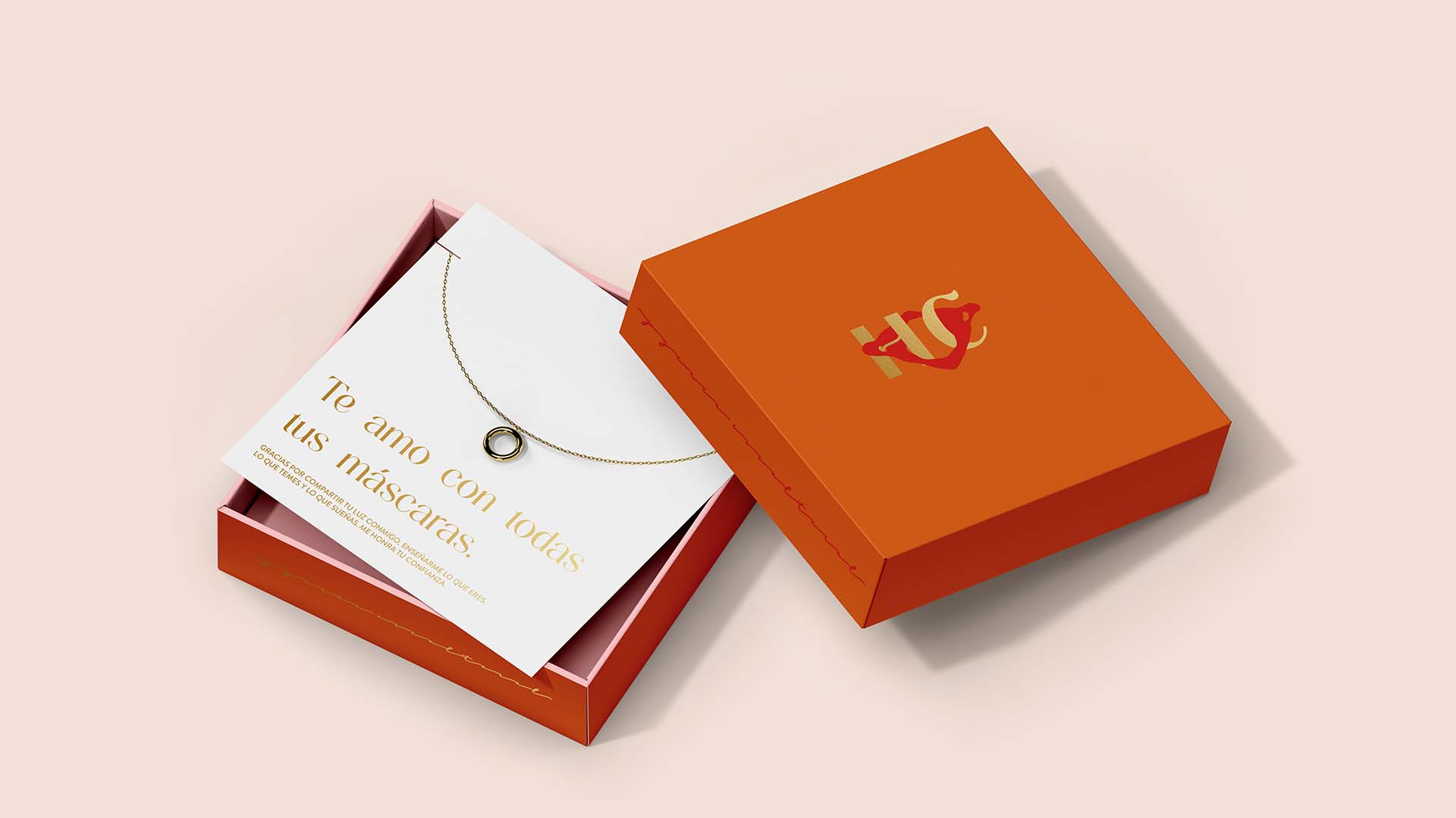
- Luxury Packaging & Graphic Deployment: We designed a packaging system that turns the unboxing experience into a ritual. From the boxes to the care cards, everything was conceived under criteria of sustainability and conscious luxury.
- Content Strategy & Brand Glossary: We structured the discursive pillars for both Anglo and Latin American markets, equipping HEC with a sophisticated, confident tone deeply connected to contemporary art.
1. Visual and Narrative Universe: Metal as Sculpture
The branding process began by deconstructing the concept behind "Hasta El Cogote." We found that wearing a piece of jewelry on the neck or hands is a powerful act of identity expression. We designed a contemporary, refined visual universe where the primary typography acts with the same solidity as bronze and silver. Black, white, and raw earth tones form the color palette, allowing the gold and natural gleam of the jewelry to be the true protagonists in both digital and physical layouts.
2. Storytelling Strategy: From Accessory to Signature Jewelry
We changed the rules of the conversation for the international public. Instead of selling mass accessories, HEC’s new narrative positions the brand within the global circuits of signature design. We developed a messaging bank that educates consumers on the smelting process, lost-wax casting, and the exclusivity of owning a wearable sculpture. The narrative celebrates the hands of the creative women behind the brand, turning the purchase of a jewelry piece into the backing of a cultural manifesto.
3. Luxury Packaging: An Extension of the Artwork
Designing packaging for the international market demanded an impeccable standard of protection and aesthetics. We developed boxes and bags with tactile finishes, high-density paper with environmental certification, and custom inserts that secure the jewelry during transit. Each package functions as an extension of the brand in the customer's home, keeping the premium experience alive long after the digital purchase.
4. Omnichannel Deployment for the Global Market
We structured the guidelines for the brand’s deployment across international channels, ranging from editorial templates for e-commerce to the format of their wholesalelookbooks for export. The result is an agile and consistent graphic ecosystem, fully prepared to compete in the most demanding design platforms worldwide without losing its native Colombian essence.
Visit our home page to see more strategic branding projects.
Results Achieved
Successful Repositioning: We successfully elevated HEC’s perception into the luxury jewelry and signature design segment, unlocking access to international audiences with high purchasing power.
Export-Ready Identity: The studio delivered a comprehensive graphic and regulatory ecosystem that allows HEC’s internal team to expand their physical and digital channels with total autonomy, consistency, and technical sophistication.
The Union of Art and Business: The new visual universe respects the brand’s decade-long heritage, translating the talent of its all-women team into a solid, magnetic, precise, and world-class commercial identity.
 EN
EN  ES
ES